Your Analytics Dashboard: Make Data-Driven Decisions
Your Reff.ly analytics dashboard is more than just numbers — it's your window into understanding how people interact with your links, where they come from, and how to optimize your campaigns for better results.
In this guide, we'll walk you through every section of your analytics dashboard and show you how to turn data into actionable insights.
📊 Overview Metrics: Your Performance at a Glance
The top of your dashboard displays four key metrics that give you an instant snapshot of your link's performance:
Total Clicks
The total number of times your link has been clicked. This includes all clicks, whether from the same person or different visitors.
What it tells you: The overall reach and engagement of your link.
Unique Visitors
The number of distinct individuals who clicked your link. This helps you understand your true audience size.
What it tells you: How many different people are engaging with your content.
Unique Rate
The percentage of unique visitors compared to total clicks. A rate of 80.2% means most clicks are from different people.
What it tells you: Whether your audience is returning or mostly new. Higher rates (70-90%) indicate broad reach, while lower rates suggest engaged repeat visitors.
Average Clicks Per Day
How many clicks your link receives on average each day.
What it tells you: The consistency and sustainability of your link's performance over time.
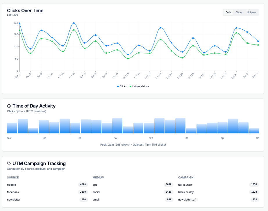
📈 Understanding Click Patterns Over Time
Clicks Over Time Graph
The line graph shows how your clicks trend over days, weeks, or months. Look for:
- Spikes: Days with unusually high traffic (check what you posted that day!)
- Trends: Is engagement growing, declining, or stable?
- Patterns: Do certain days of the week perform better?
Time of Day Activity
This breakdown shows when your audience is most active throughout the day:
- Peak hours: When you see the highest engagement
- Off-peak hours: Times when your audience is less active
- Timezone considerations: Your audience's activity reflects their local time
🎯 UTM Campaign Tracking
UTM parameters help you track which marketing campaigns drive the most traffic. Your dashboard breaks this down by:
Source
Where the traffic originated (e.g., google, facebook, newsletter)
Medium
The marketing channel (e.g., cpc for paid ads, social, email)
Campaign
The specific campaign name (e.g., spring_sale, product_launch)
Example UTM Structure:
https://reff.ly/abc?utm_source=facebook&utm_medium=social&utm_campaign=spring_sale🌍 Geographic Insights
Understanding where your audience is located helps you:
- Tailor content for specific regions
- Schedule posts for appropriate time zones
- Identify new market opportunities
- Localize your marketing efforts
What the data shows:
- Top Countries: Your primary markets ranked by traffic volume
- Top Cities: Urban centers where your audience concentrates
- Regional trends: Growth opportunities in emerging markets
🔗 Top Referrers: Where Your Traffic Comes From
The Top Referrers section shows which websites and platforms are sending people to your link:
Direct Traffic
Visitors who typed your link directly or clicked from sources without referrer data (like some mobile apps)
Search Engines
Traffic from Google, Bing, and other search platforms
Social Media
Clicks from Facebook, Twitter, LinkedIn, Instagram, and other social platforms
Websites & Blogs
Traffic from specific websites that linked to you
💻 Device & Browser Intelligence
Understanding your audience's technical setup helps you optimize the user experience:
Device Breakdown
Desktop vs. Mobile vs. Tablet usage tells you how to prioritize your design and testing efforts.
- High mobile traffic? Ensure your landing pages are mobile-optimized
- Desktop-heavy? You might have a professional B2B audience
Browser & Operating System Data
This data helps you:
- Prioritize browser testing (focus on Chrome if it's 70% of your traffic)
- Understand platform preferences (iOS vs. Android, Windows vs. Mac)
- Identify potential compatibility issues
✨ Best Practices for Using Analytics
1. Check Analytics Regularly
Review your dashboard weekly to spot trends early. Daily checks during active campaigns help you adjust in real-time.
2. Focus on Key Metrics
Don't get overwhelmed by data. Start with:
- Total clicks (reach)
- Top referrers (best channels)
- Peak activity times (when to post)
3. A/B Test Your Strategy
Create multiple short links for the same destination with different UTM parameters to test which campaigns perform best.
4. Set Up UTM Tracking Properly
Always include UTM parameters for campaigns:
utm_source=[platform]&utm_medium=[channel]&utm_campaign=[name]5. Look for Patterns, Not Just Numbers
A sudden spike or drop tells a story. Investigate what changed — did you post on a new platform? Change your messaging? Run a promotion?
🎯 Your analytics dashboard is your compass for smarter link management. Use these insights to understand your audience, refine your strategy, and boost your results.
Start exploring your data today and turn numbers into growth.
Ready to Get Started?
Create your first short link today and start tracking your success.
Shorten Your First Link Today